Empowering consistency across products with Atos Design System.
Year
2019-2020
Duration
1 year
Scope of work
Research
Interaction Design
Visual Design
Prototyping
Design System

Context
In 2019, Caixa Seguradora's design team launched a drive for standardized digital channels, rectifying inconsistencies in visuals and texts, culminating in developing a new Design System.
Understanding the scenario
In the project's initial phase, conducting discovery steps was crucial to gaining deep insights into Caixa Seguradora's environment. This helped determine the most efficient and precise approach to kick-starting the project.
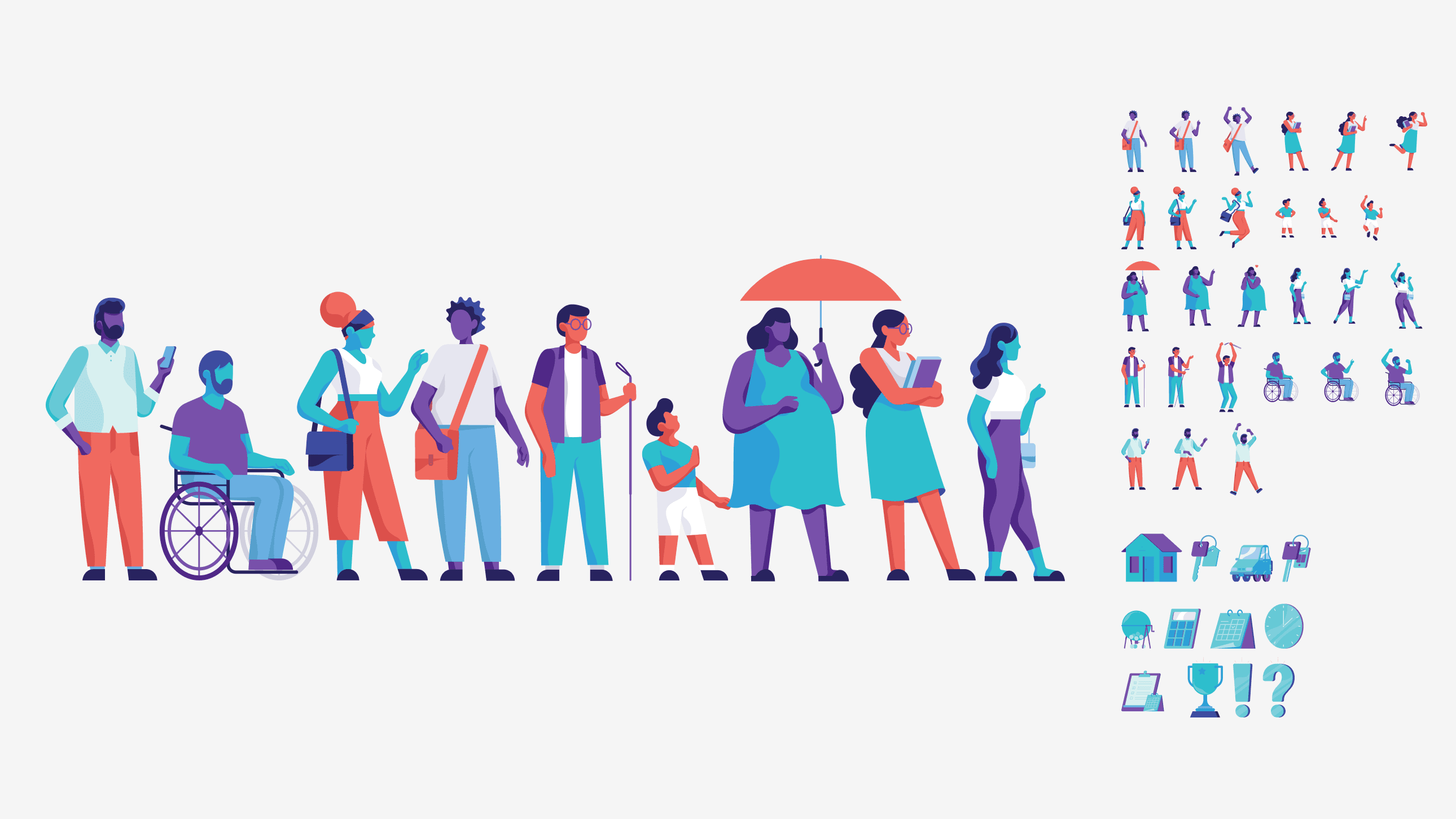
Examine all channels to identify current components and discover possibilities for new ones. Additionally, gain a comprehensive understanding of how Caixa Seguradora presents its branding to the public.
Business Understanding and Insurance Glossary
Undertake thorough research into the functionality of Caixa Seguradora's products to pinpoint areas for improvement and unearth potential business opportunities. We collaborated with experts to fully understand the industry vocabulary, seamlessly integrating it into our products.

Main pains and notes found
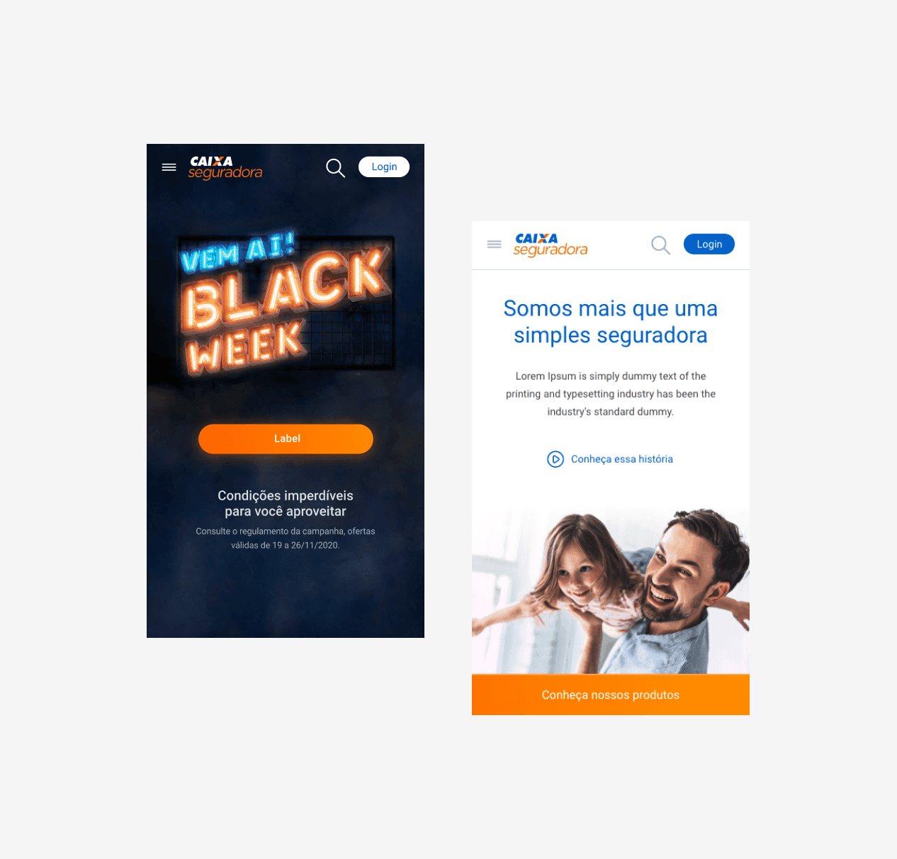
Inconsistency between channels
The inconsistency across Caixa Seguradora's various products and channels, in both user experience and interface, creates a misleading impression that users are engaging with distinct companies.
Brand's digital issues
Each product was assigned a distinct color for easy identification at bank branches. This practice was extended to digital platforms, resulting in additional inconsistencies and variations in user experience across different channels.
Products lack distinctive attributes
A key project challenge is modularization among products. While purchase processes are similar, each product possesses unique value attributes.

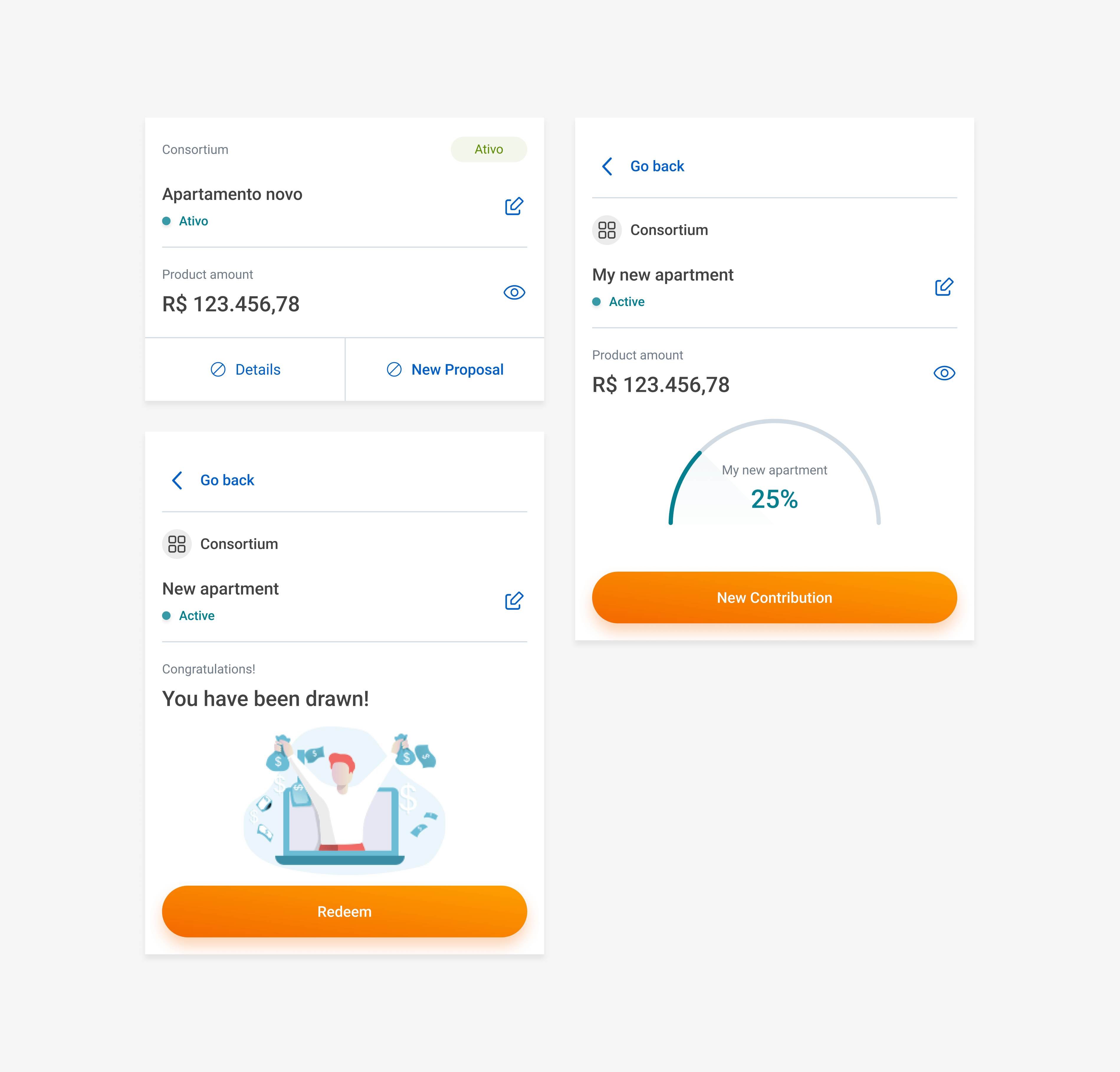
Architecture review
During validation, a new proposal emerged to enhance navigation between environments, optimize content consumption, and drive engagement for conversion.
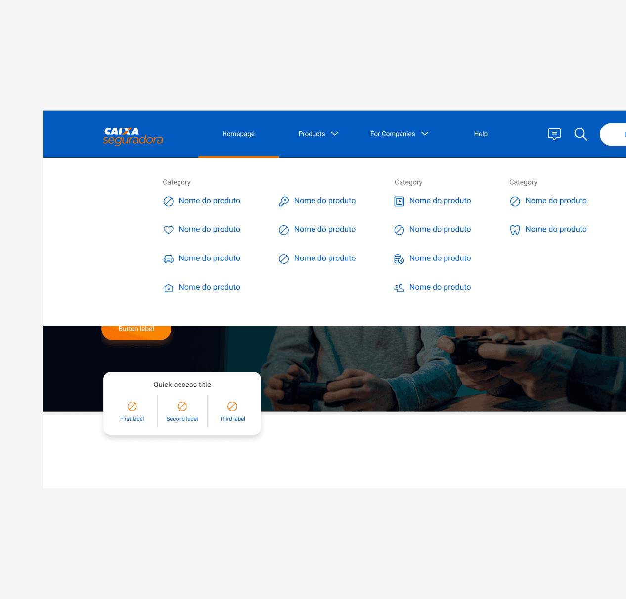
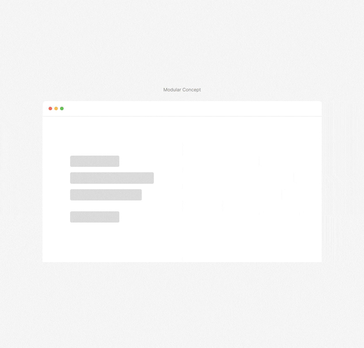
Modular concept
The module design should accommodate multiple contexts, focusing on its versatility across different pages rather than a vertical layout on a single page.
First design tests
We also generated numerous visual interface proposals, aiming to establish a cohesive visual direction for the project.

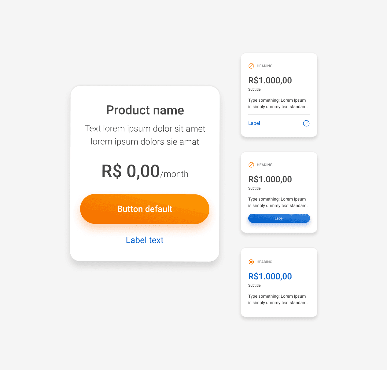
Design Patterns and Tokens
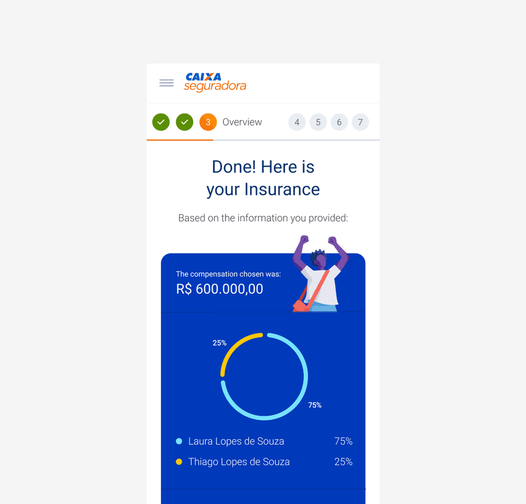
New Theme
Transitioning to the visual aspect, we establish color palettes, spacing, shadows, typography, and various design patterns to ensure consistency across components and modules. To maintain this consistency, we create all elements using design tokens. Here are some examples.