

I led the end-to-end design process, developed the new system visuals, and facilitated usability testing. These efforts resulted in a streamlined and intuitive product registration experience.
OUTCOME
OUTCOME
60%
Reduction in fields & manual input
40%
Less time spent on daily processes
150%
More clients upgraded vs. previous version
Breaking Down the Process…
Navigating the Complexity
of Winthor
Since this was the first feature I worked on, understanding the system’s architecture was my first challenge. I conducted a deep dive into Winthor’s existing product registration process, mapping out user flows, system logic, and the UI components used throughout the workflow.

The First Major Hurdle: Structuring 430+ Fields
During the initial audit, I discovered that over 430 fields were displayed to users in an unstructured format—without categorization or prioritization. This created a significant usability bottleneck, making it difficult for users to register products efficiently.
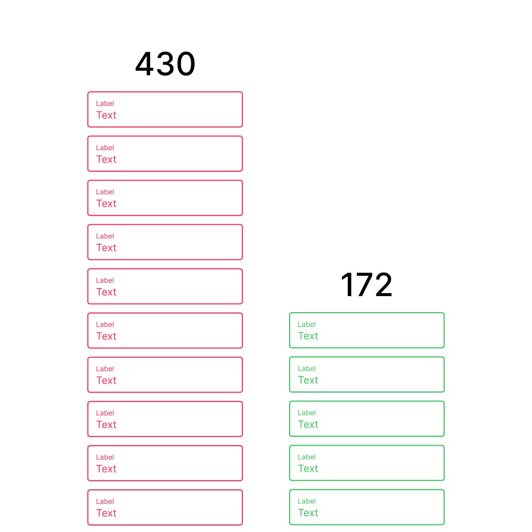
Reduction from 430 to 172 fields.

Categorization and organization into groups.
Mapping the
User Journey
With a solid understanding of the system, we conducted user research to identify key pain points. We mapped out a basic registration flow and defined three primary user personas based on their interaction with the system. This helped us tailor the solution to different user needs.

Talking to Customers: Real Insights from the Field
While internal research gave us a solid foundation, direct user feedback was crucial. We conducted rounds of user interviews to understand real-world challenges. Visiting clients in person proved invaluable, providing deeper insights into their workflows and frustrations.

From Research to Prototyping
Armed with research findings, we moved to prototyping. We started with low-fidelity wireframes, which allowed us to quickly test core concepts with users. At this stage, we worked closely with the engineering and product management teams to assess feasibility and prioritize key features.


Final Designs: A Modern, Scalable System
After validating our low-fidelity prototype through usability testing, we iterated based on user feedback and developed a high-fidelity prototype. To ensure a scalable and cohesive experience, we also built a new Design System that aligned with both user expectations and business requirements.


Old System preview
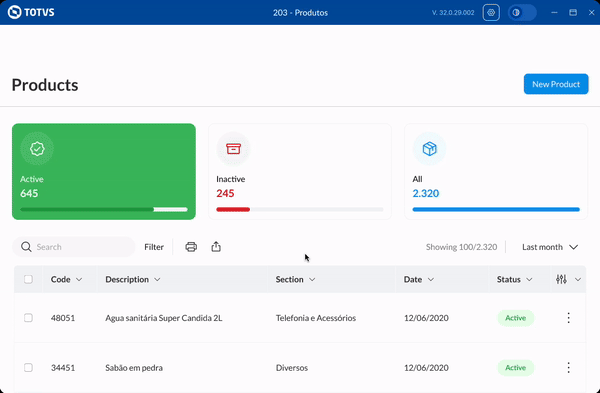
New System preview
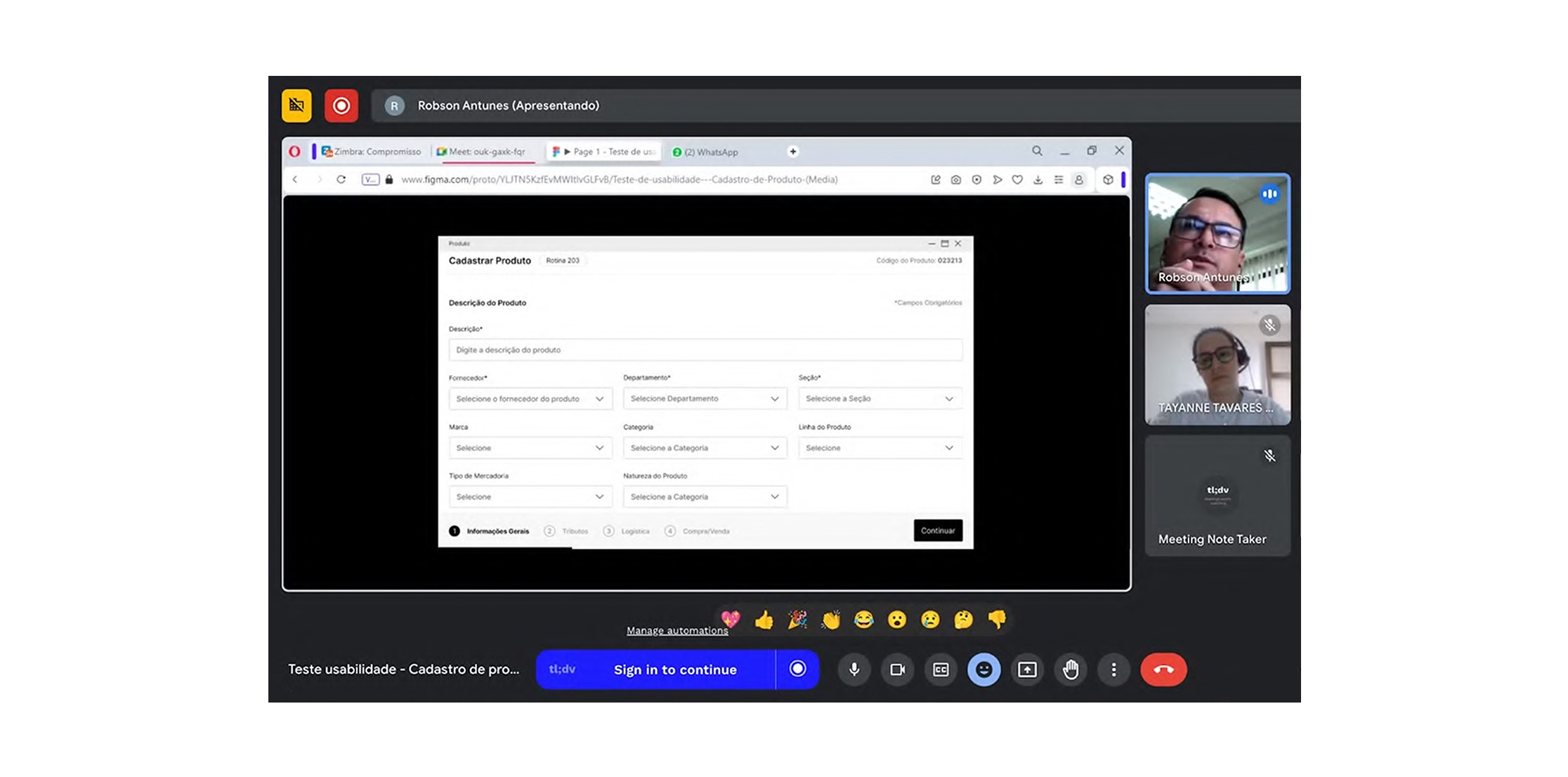
Final Testing
and Handoff
The final usability tests confirmed significant improvements in efficiency and user satisfaction. With validated designs in place, we prepared the handoff documentation and conducted a detailed review with the engineering team to ensure a smooth implementation.


"A completely revamped Routine 203, featuring new search engines, a much lighter design, and a web-focused approach that's easier to use. It includes more dynamic filters, and I believe it will bring significant benefits to all of us."
Douglas Itimura
Elétrica AREA

"We really like this version because it brings a lot of modernization to the layout, and most importantly, it enhances daily usage efficiency."
Leandro Fontinelli
ABC Distribuidora
Key Takeaways
A modernized interface
that enhances usability and provides a more visually appealing experience
A simplified and faster registration process
increasing efficiency and ease of use
A structured workflow
breaking down steps based on each user’s needs
Improved productivity and performance
reducing friction in product registration
This redesign transformed product registration in Winthor, making it faster, smarter, and user-friendly, while setting the foundation for future enhancements. 🚀
